
Software used:
Intermediate
There's this big notion that goes around that cheating is always a bad thing. Let me start by telling you that, as long as you don't cheat others or yourself, it isn't. Cheating is, in a lot of ways, merely a way of getting quicker and sometimes better results or simply as a studying mechanism. It's all about perspective. If you use a cheating software in a video game to get a better score, for example, you are cheating yourself (and if the game is online, you are cheating others too) but if you use it to find secret things in the game, study the level design, learn how a company does X thing and so on... then you are using a cheat for learning purposes. If you are using layers in a digital painting or the undo tool, for a traditional artist you may be cheating, but the effort is still being put into it and you are getting better results from it. Point is, what I call "cheating" is merely a technique that a lot of pixel artists use and it isn't that well discussed or revealed, it's also a technique that has been around in the industry for years, only the process that has changed. So with that out of the way, let's get going.
This technique in particularly it's called "Index Painting" and the first time I've seen it being discussed openly was in Dan Fessler's Blog where he posted an amazing tutorial on it as well as some of the patterns he uses (and that I'll be using in this tutorial), so I do suggest going there and giving it a read. In the past this technique has been used in big videogames either in the form of scanning paintings and objects and compressing them or by pre-rendering 3D models. This technique is meant to be used sparingly and should never be used "as is" like in this tutorial, some form of manual editing and touch-ups should always be used with this to get crisper and better details as it will often result in some weird artifacts here and there.
Why should I use Index Painting if manual pixel art will always give be better results?
Well, if you can afford to not use it then you most definetely should go with that, this technique is particularly useful if you are having trouble spriting certain objects, forms and so on. It's also incredibly useful as a base for more complex backgrounds or to blend things in the background. Maybe you have this complex cave background in your stage and think it would benefit from some contact shadows, or you want things to look like they have depth and so on. Like many cheats, this is particularly useful for speeding up your process. Maybe you have a piece of concept art that you want to turn into a sprite, maybe a better way of doing it is by simply setting it up through the filters and then adjusting it as needed. It gets 90% of the work done for you and makes sure it will look at least decent. Maybe you have a cool background in mind and is having trouble drawing it, perhaps you can take a similar photograph, run it through the filter and have an easier time figuring out how it would look in pixel art form. The possibilities are endless, you just have to be creative about it.
Drawing the Tile
Let's start by drawing our tile, in Photoshop I created a 128x128 file, I like to work big and scale down when doing this, but you can absolutely do it in your final size from the start.
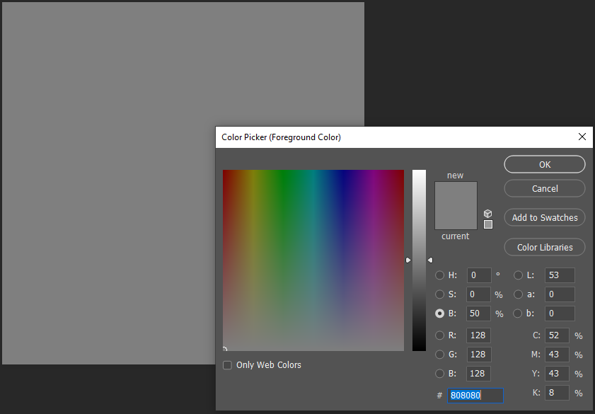
After that, I set my background color to a 50% grey. This is useful as it helps you visualize your drawing a little better as starting from white or black may make it hard to make the picture uniform and will require extra time adjusting it later.
One great way to pick the amount of gray is by opening your color picker and in the right where it has: H (Hue), S (Saturation), and B (Brightness) you just set everything to 0 and in the Brightness field you type in 50 to get 50%.
When drawing you can absolutely use colors, but it's extremely advised to use only greyscale as the filters will only really use contrast to separate the colors later down and it might give you some funky details.
After that, doing the tiles is a fairly simplistic process, you just draw. In here I used a drawing tablet, but you can definitely use your mouse, pictures, textures and what not. It's often way harder to get better results when doing so, but I'll later down draw a grass tile using only my mouse.
I start of by using a 30% black to define my shapes and using the Offset tool (Filter > Other > Offset) to make it tile together properly. I then offset by half of my document size (if your document is 128x128 you then offset it by 64x64) I then keep drawing, adding detail and offsetting it to make it tile until I get something like this:
It's a good idea to think of your drawing as a pixel art already in this step. You can add a lot of details but that will only make it look noisy and muddy in the end. So work with big shapes, add contrast and don't worry too much about adding detail to every single portion of your tile. Once you are satisfied with your drawing, it's time to make the magic happen.
Adding the Filters
Create a new layer and click on the Paint Bucket Tool (G), at the top of the screen where it says "Foreground" click on it and change it to "Pattern" and then pick one of Fessler's Patterns and then click on the screen to paint. Then on the layer's panel set that layer blending mode to Overlay and change the layer's opacity to something like 10% or 5% (don't worry, it looks weird now but it will make more sense on the next step) and double click on the layer to open the context menu and then click on "Create Clipping Mask).
Then, simply go to Layer > New Adjustment Layer and add a Levels, Posteize and a Black and White and stack them in the following order:
Now, let's understand what each of these adjustment layers is doing:
Levels this is where you can fine-tweak your contrast to get a better results, you may push your blacks, whites and midtones. I'd suggest manually playing with the sliders here to see what works and what doesn't. This method is 100% non-destructive and if you screw up you can always just delete the Levels layer, add a new one and start fresh.
Posterize is crunching your colors to a set number. I suggest not going over 5 or 6, as it will create very muddy textures and lose the pixel art effect we are going for. In this one, I used only 5.
Black and White if for some reason you added even a small hint of color in your piece this will just make sure it's in greyscale, not 100% necessary but can lead to some weird results as the posterize tends to change the value of colors sometimes.
Also make sure to do the Clipping Mask for all the layers.
So let's understand what this is doing in the hierarchy (starting from the bottom):
Tile: Is your base image, the bitmap you want to turn into a pixel art.
Pattern Layer: It's your dithering pattern, it's opacity controls how much or how little dithering you want in your piece.
Levels: Adjust your contrast, it's advisable to go through this after adding all the adjustment layers so you can have a better visualization of your final tile in real time.
Posterize: It's the number of colors that will be present in your piece.
Black and White: It's only there to make sure everything is in greyscale.
After you are satisfied with your your work, it's time to add your colors. We do that by once again creating a New Adjustment Layer and adding a Gradient Map:
It's a good idea to spend some time in here as good colors can either make it or break a pixel art. And you can always fine tweak this later once you rasterize your image since it will never add or remove colors from it, it's just a matter of painting colors with Contiguous setting turned off. And you are pretty much done! It's a good idea to go back to your adjustment layers and your pattern settings to see what works and what doesn't for you. For example, here's the image with no dithering:
You can then duplicate your tiles, put them all in the same layer (don't forget to lock the transparency if you do so!) and add an extra layer in between your tiles and your pattern to draw shadows and high lights using a soft brush or the gradient tool.
The great thing about this method is that it's pretty much guaranteed to tile if you work smart and pay attention to where you are drawing shadows and highlights and here's our final tile, complete with all that sweet inner shadow that games seem to be doing nowadays:
Drawing the Grass:
We start in the same way except this time we'll be working from black to white and this time I'll be drawing with the mouse, so it may not look the prettiest.
Just start by drawing your leaves and slowly working your way up from dark to light.
Here's our final image:
If you are more astute than I am, you'll realize I made a huge mistake by drawing on my background layer. This means I now have to separate the grass from the white background manually. Which is easy to do by just selecting your background, going to Select > Modify > Expand and setting it to 1px. This will get rid of the anti-aliasing created by the brush.
It's important to not have any transparency in your grass or any elements you wish to add to your tile, so you can simply just duplicate the layer and merge them a few dozen times to crunch them:
The process then is exactly the same as we did for the tile previously.
Adding Contact Shadows
We then finish things off by adding the shadows from the grass.
We go back to our Tile and add a layer in between the Pattern Layer and the Tile layer and with a soft brush we add in some black to where our shadows should go:
It's a fairly simple process and the beauty of it all is that the shadows will take into account what's beneath it (in this case the tile) and maintain the shape.
